

Somewhere in your stylesheet there is probably a line like background: var(--blue-500). It looks tidy. It is easy to read, easy to grep for, and it matches the naming that most color tools and frameworks hand you out of the box. For a single light theme, it works perfectly well.
Then someone asks for dark mode, and the tidy naming turns into a liability. A button that used --blue-500 on a white page now sits on a near-black page, and the same shade that felt confident yesterday looks dim, muddy, or painfully bright. Fixing it means touching every component that referenced the raw shade.
This article explains why that happens, what the better structure looks like, and how to migrate an existing color system without rewriting your whole interface in one weekend.
Why a Shade Name Is Not a Purpose
A name like blue-500 describes what a color is. It says nothing about what the color is for. Is it the primary button fill? A link? A focus ring? A chart line? The name cannot tell you, so every developer who reaches for it has to guess, and guesses drift over time.
That drift is invisible while you have one theme, because every guess renders the same blue. The moment a second theme exists, the guesses diverge. A link that should become lighter on a dark page and a chart line that should stay saturated both point at the same variable, and there is no single value that makes both look right.
Naming by purpose solves this at the root. A token such as --color-action-primary says what the color does, which means you can change what it points to per theme without touching a single component. The component keeps asking for "the primary action color" and each theme answers in its own way.
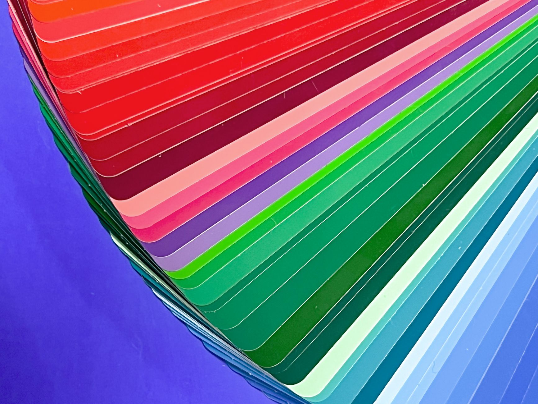 Photo by Viktorya Sergeeva 🫂 on Pexels
The Two Layers Most Systems Need
The cleanest way to think about this is as two layers. The first layer is the primitive palette: the raw scales, such as ten steps of blue, ten steps of gray, and so on. These names are allowed to describe appearance, because they are never used directly in components.
The second layer is the semantic layer: tokens named for roles, such as surface, text, border, and action. Each semantic token points at a primitive, and the pointer is what changes between themes. In light mode, the surface token might point at the lightest gray step. In dark mode, it points at the darkest.
This is the same idea the W3C Design Tokens Community Group is standardizing, where tokens carry a type and a value and can reference one another as aliases. You do not need to wait for tooling to mature to benefit from it, because plain CSS can express both layers today.
What Actually Goes Wrong in Dark Mode
Dark mode is not a color inversion, and treating it as one is the most common source of ugly results. Pure black backgrounds with pure white text produce harsh contrast that many people find tiring to read. Saturated colors that look lively on white often vibrate against dark surfaces, so the same hue usually needs a lighter, slightly less saturated step.
Elevation also flips. On a light page, a raised card is often shown with a shadow. On a dark page, shadows barely register, so raised surfaces are usually shown by making them slightly lighter than the background instead. A system that only has gray-100 through gray-900 and no notion of "raised surface" has nowhere to put that rule.
Then there is text. Body text, secondary text, and disabled text each need their own relationship to the background in each theme. With raw shade names, that relationship lives in the head of whoever wrote the component. With semantic names, it lives in one table that anyone can read.
Contrast Is a Property of Pairs, Not Colors
A color does not pass or fail accessibility on its own. Only a pairing of a foreground and a background can be measured, which is why the Web Content Accessibility Guidelines express their requirements as ratios between two colors. The common thresholds are 4.5 to 1 for normal body text and 3 to 1 for large text and interface components.
This matters for tokens because a pair that passes in light mode may fail in dark mode, even when you picked the dark shades carefully. A mid-tone blue on white can clear 4.5 to 1 comfortably, while the same blue on a dark gray surface falls short.
If your tokens are named by role, the pairs are easy to audit: text on surface, text on action, border on surface, and so on. You can check each role pair per theme, and the list stays short. If your tokens are named by shade, the number of possible pairs is every shade against every other shade, and nobody audits that.
 Photo by Mayara Caroline Mombelli on Pexels
Where Raw Names Quietly Cause Bugs
Raw shade names tend to fail in a few predictable places. The first is hover and active states, where someone decided that the hover color is "one step darker" and encoded that as blue-600. In dark mode, one step darker is the wrong direction, because hover usually needs to get lighter against a dark surface.
The second is component libraries that ship with their own hard-coded shades. If a third-party widget uses #3b82f6 directly, no amount of theme switching in your tokens will reach it. A semantic layer at least gives you one place to override it from.
The third is charts and data visualization, where categorical colors need to stay distinguishable from one another and from the background. Those usually need their own dedicated tokens rather than borrowing from the action or status colors.
"Teams almost never regret adding a semantic layer early, but they nearly always regret adding it after the third theme. The cost of renaming grows with every component that already knows a hex value." - Dennis Traina, founder of 137Foundry
How Native CSS Handles the Two Layers
You do not need a build step to implement any of this. CSS custom properties cascade, which means you can redefine the semantic tokens under a different selector and every component updates on its own. A typical setup defines the primitives once on the root, then defines the semantic tokens twice: once for the default theme and once under a data attribute or media query for the alternate theme.
The component CSS never changes. It reads var(--color-surface), and the browser resolves whichever value is currently in scope. That is the whole trick, and it is why this structure scales from a small marketing site to a large application.
 Photo by Lisa Fotios on Pexels
If you also want to respect the visitor's operating system preference, the prefers-color-scheme media query lets you apply the dark definitions automatically, while a manual toggle can override it by setting an attribute. Keep the two paths pointing at the same set of semantic tokens so you maintain one definition per theme instead of two.
Building the Scales Without Guessing
The weak point in most hand-built systems is the primitive scale. Picking ten steps of a hue by eye produces uneven jumps: two neighboring steps look nearly identical while the next pair looks like a different color. That unevenness is what makes semantic mappings feel arbitrary, because there is no reliable "one step lighter" to reach for.
A generator takes the guesswork out of that step. The color system generator on EvvyTools starts from one brand color, builds a ten-step tonal scale, and maps those steps to semantic tokens, with a contrast matrix so you can see which pairings clear the thresholds before you commit to them. It also exports the result as CSS custom properties, Tailwind config, SCSS variables, or W3C-style JSON, so the output drops into whatever your project already uses.
Used well, this is a starting point rather than a finished design. You still decide which steps map to which roles, but you make that decision looking at evenly spaced scales and measured contrast instead of eyeballing swatches.
 Photo by picjumbo.com on Pexels
A Safe Order for Migrating an Existing System
If your product already ships with raw shade names everywhere, the answer is not a big-bang rewrite. A safer path is to add the semantic layer next to the existing variables, then move components over gradually. Nothing breaks, because the old variables keep working the entire time.
Start by listing the roles your interface actually uses. For most products it is a short list: a few surfaces, three or four text levels, borders, one primary action, a handful of status colors, and a focus ring. Define a semantic token for each, pointing at the current primitive so the light theme looks identical to before.
Next, migrate component by component, replacing raw references with the matching semantic token. Do the most reused components first, such as buttons, inputs, and cards, since they remove the most raw references per hour of work. Only after enough of the interface is migrated should you define the dark theme values, which at that point is a single block of overrides.
Finally, add a lint rule or a code review habit that flags raw shade references in component files. Without that guardrail, the old pattern creeps back within a few sprints.
Mistakes to Avoid While You Restructure
A few traps show up repeatedly. The first is creating too many semantic tokens. If you end up with a token for every individual component state, you have rebuilt the raw palette with longer names. Aim for roles that many components share.
The second is naming tokens after themes, such as --color-dark-surface. That bakes the theme into the name and brings back the original problem. The token should be called surface in every theme, with the value changing underneath it.
The third is skipping the check on text over colored fills. Teams often verify body text on the page background and forget that white text on the primary button needs its own passing ratio. Put every foreground and background pairing you actually use through a contrast check in each theme, not just the default one.
The fourth is treating the scale as final. Brand colors change, and a system built on a generated scale can be regenerated from the new brand color without rewriting any component, as long as the semantic mappings hold. That flexibility is the real payoff of the structure.
A Short Checklist You Can Use This Week
If you want to move without a long project, run through this list. Write down every role your interface uses and give each a purpose-based name. Keep raw scales as primitives that components never reference directly. Define the alternate theme as one block of overrides to the semantic tokens only.
Then check every text and fill pairing against the contrast ratios in each theme. Review hover, focus, and disabled states separately for dark mode, since the direction of "lighter" and "darker" flips. Finally, add a review rule that rejects new raw shade references in component files.
You can browse the rest of the EvvyTools tools directory for related utilities, or read more practical guides on the EvvyTools blog. The next time someone asks for a new theme, you will be editing one block of overrides instead of hunting through every component for a hard-coded blue.
For teams that standardize on a utility framework, the same two-layer idea carries over, since Tailwind CSS lets you point its color keys at your own custom properties. That keeps your semantic names in charge no matter which tooling sits on top.