Every web project eventually hits the same wall. You start with one brand color, add a few button states, pick a background, and before long you have eight slightly different shades of blue that were never supposed to be different. The header uses #2563eb. A button uses #2660e8. A hover state got typed from memory and landed somewhere in between. Nobody can say which one is official because nobody ever wrote that down.
The root of that problem is almost never a lack of taste. It is a lack of a system. Part of what makes web color systems hard to maintain is that colors can be expressed in three different formats, HEX, RGB, and HSL, and each one obscures different information. Knowing when to use each format, and how they relate to each other, is what separates a color palette that holds together from one that keeps drifting.
This guide covers what each format is actually representing, how to convert between them, how to generate a complete tonal scale from a single starting color, and a handful of practices that keep a color system from falling apart as a project grows.
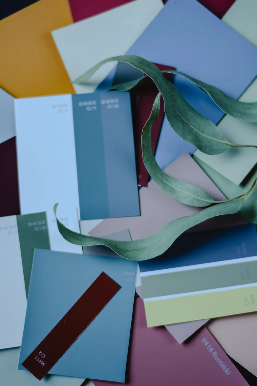
 Photo by cottonbro studio on Pexels
What HEX, RGB, and HSL Are Actually Describing
All three formats describe the same thing: a specific point in the sRGB color space. The difference is in how that point is represented.
HEX is the format most developers encounter first. A value like #3b82f6 encodes the red, green, and blue channels as pairs of hexadecimal digits. The first pair, 3b, is the red channel. The middle pair, 82, is green. The last pair, f6, is blue. Each pair runs from 00 (zero intensity) to ff (full intensity, or 255 in decimal). HEX is compact and easy to copy between tools, which is why design software, browser dev tools, and CSS files all default to it.
The MDN reference on CSS color values covers the full HEX syntax including four-digit and eight-digit variants, which support transparency through an alpha channel appended directly to the hex string.
RGB expresses the same three channels as decimal integers from 0 to 255. So #3b82f6 becomes rgb(59, 130, 246). This is more readable at a glance because you can actually reason about the numbers. A blue channel value of 246 is clearly near maximum. That same information is harder to extract from f6 without doing mental hex-to-decimal conversion. RGB also has an alpha variant, RGBA, where a fourth value from 0 to 1 controls transparency. This is why rgba(0, 0, 0, 0.5) is the standard for a semi-transparent black overlay.
HSL stands for Hue, Saturation, and Lightness. Rather than describing the composition of a color in terms of light channels, it describes a color in terms a human can reason about directly.
Hue is a degree value on a 360-degree color wheel. Zero degrees and 360 degrees are both red. 120 degrees is green. 240 degrees is blue. Every color has a position on that wheel, and colors that are close together in hue look related to the human eye.
Saturation is how vivid or muted the color is, expressed as a percentage. 100% saturation is the purest version of a hue. 0% saturation is gray, regardless of hue.
Lightness is how bright or dark the color is, also as a percentage. 0% lightness is always black. 100% lightness is always white. 50% lightness is the purest version of the hue at that saturation.
Why HEX Persists Despite Being Hard to Reason About
HEX survives because it is compact and unambiguous. A six-character string is easy to store, share, and paste. When a designer hands off a color from Figma or Sketch, it arrives as a HEX value because that is what design tools export by default. For storing and transmitting exact color values, HEX is fine. For generating a coherent palette, it is the wrong format to work in.
Why HSL Changes How You Think About Palette Generation
The HSL format is what makes systematic palette generation possible. You can hold hue and saturation constant while varying only lightness to produce a full family of shades that all read as the same color.
hsl(220, 90%, 50%) is a vivid blue. hsl(220, 90%, 85%) is a light tint of that blue. hsl(220, 90%, 20%) is a dark shade of it. All three are clearly related because they share the same hue and saturation. If you tried to produce the same family in HEX, you would be adjusting three channel values simultaneously and hoping the result looked intentional. With HSL, you are turning one dial at a time.
The CSS Colors Level 4 specification describes the full color space model underlying these formats and includes newer notations like oklch that give even more perceptually uniform control, though HEX, RGB, and HSL remain the formats with the widest browser support and tooling compatibility.
 Photo by Pixabay on Pexels
How to Convert Colors and Build a Tonal Scale
Step 1: Get Your Starting Color Into All Three Formats
If your brand color came from a logo file, a brand guide, or a Figma component, it probably arrived as HEX. That is a fine starting point, but you need to see the HSL equivalent before you can work with it systematically.
EvvyTools has a Color Converter and Palette Generator that handles this conversion automatically. Paste your HEX value and it returns the equivalent RGB and HSL representations, along with an interactive HSL picker where you can adjust the color and see all three formats update together. There is also a Three.js 3D visualization showing where your color sits in the full sRGB color space, which helps develop intuition for how much room you have to work with in any direction.
Step 2: Generate Your Tonal Scale
A tonal scale is a set of values that move from very light to very dark while holding the same hue and saturation. The most practical pattern for a design system is 10 steps, with lightness values stepping down from roughly 95% to 10%.
If your brand color is hsl(220, 90%, 50%), your tonal scale might look like this:
- 50:
hsl(220, 90%, 95%)- near-white tint, good for large background areas - 100:
hsl(220, 90%, 90%)- subtle background tint - 200:
hsl(220, 90%, 80%)- light highlight, disabled states - 300:
hsl(220, 90%, 70%)- secondary interactive elements - 400:
hsl(220, 90%, 60%)- lighter version of the brand color - 500:
hsl(220, 90%, 50%)- the base brand color - 600:
hsl(220, 90%, 40%)- darker variant, used for hover states - 700:
hsl(220, 90%, 30%)- strong emphasis - 800:
hsl(220, 90%, 20%)- near-dark, good for text on light backgrounds - 900:
hsl(220, 90%, 10%)- deep dark shade
The color converter generates this scale automatically. You can copy the HEX values for each step directly into your CSS variables or your design tool tokens.
Step 3: Check Contrast Before You Commit
The most common mistake in building a color system is skipping the accessibility check. WCAG 2.1 requires a minimum 4.5:1 contrast ratio between normal text and its background, and at least 3:1 for large text and UI components. These are not arbitrary numbers. They correspond to real readability thresholds for users with low vision, aging eyes, or challenging lighting conditions.
The WebAIM Contrast Checker is the standard tool for verifying contrast ratios. Paste your foreground and background colors and it returns the exact ratio with a pass/fail result for both AA and AAA compliance levels. The WCAG 2.1 contrast minimum guidance explains the reasoning behind each threshold if you want to understand why these specific numbers were chosen.
Run your primary text color against your primary background, and your button label against your button background, before you finalize any values. It is far easier to adjust a tonal scale at the palette stage than to chase contrast failures through a component library later.
 Photo by Jan van der Wolf on Pexels
Four Practices That Keep a Color System From Drifting
Define everything as CSS custom properties from the start. A CSS variable like --color-brand-500: #3b82f6; defined in :root gives you one place to update when anything changes. If the brand color shifts, you change one line. If you have hardcoded hex values scattered across component files, you are hunting. Custom properties also make it possible to remap values for dark mode without changing any component code.
Build a semantic layer on top of your palette. Your palette names values by shade (brand-500, brand-600). Your semantic layer names values by purpose: --color-surface-primary, --color-text-heading, --color-interactive-hover. Components reference semantic tokens, not palette tokens. When you add dark mode, you remap the semantic tokens to different palette values under a prefers-color-scheme media query. Nothing in the component layer changes.
Limit your palette intentionally. A production design system generally needs one primary color with 8 to 10 tonal steps, one neutral (gray) with similar steps, and 2 to 3 semantic accent colors for success, warning, and error states. That is roughly 40 to 60 named values. More than that becomes a maintenance problem because developers start inventing new tokens rather than reusing existing ones.
Generate complementary colors deliberately. A complementary color sits 180 degrees across the color wheel from your primary. Analogous colors are 30 to 60 degrees away on either side. Both feel intentional when used for accent colors because they have a mathematical relationship to your primary. The palette generator shows these relationships automatically. The CSS Generator on EvvyTools lets you apply colors from your palette to gradients, box shadows, and glassmorphism effects with a live preview, which helps verify how palette choices translate into actual UI before you write any component code.
"Every color problem we fix at scale on client projects comes back to the same missing piece: semantic tokens. If your components reference palette tokens directly, you own a rigid system that cannot adapt. If they reference semantic tokens, you own a flexible one that can be re-skinned in an afternoon." - Dennis Traina, 137Foundry
Related Tools and Resources
If you want to take the token system further, the Design Token and Color System Generator on EvvyTools generates a complete semantic token mapping from a single brand color, with export options for CSS custom properties, Tailwind configuration, SCSS variables, and W3C Design Token JSON format. It is the logical next step once you have your base palette locked in.
For deepening your understanding of the HSL color model specifically, the MDN documentation on the hsl() function covers the full syntax including the newer space-separated notation and relative color syntax introduced in CSS Colors Level 5.
If you work on applications with strict accessibility requirements, the WCAG guidance on use of color addresses situations where contrast ratios alone are not enough - particularly cases where color is used as the only means of conveying information.
Building a color system is more a decision-making exercise than a technical one. The tools handle conversion, scale generation, and contrast checking. What they cannot do is decide how many colors you need, what each one should mean, or what you will call things so that a developer who joins six months from now can understand your system without asking.
Start with your brand color, convert it to HSL to understand its structure, generate a tonal scale, verify the contrast ratios for your primary text and background pairs, and define your semantic layer before you write your first component. That sequence prevents the slow drift that turns a clean starting palette into a pile of one-off values nobody can explain.